BW to Color

Above is my original image for my black and white to color project. I selected this photo to use because it is an old photo from high school that brings back good memories. When selecting my colors from adobe.color.com, I wanted to include lots of pinks and greens. This is because my hoodie is pink and I really like the color green. The first color group I used was Square.
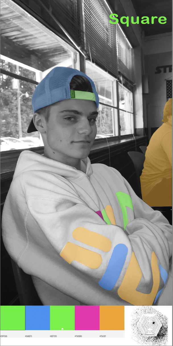
When creating this photo, the most time consuming aspect was tracing the lettering. Overall this project took me 2 hours to complete. I filled in the same objects for every photo and switched the colors, because I really liked how the first photo turned out. I came across a few challenges when doing the project. I could not find the adobe color tab on my software, so I had to manually type in the color codes. The second issue I had was using the lasso tool. At first it was giving me some issues, regarding a nice outline of what I was tracing.

I fixed this issue by using the polygonal lasso tool, which let me draw better lines. I want my audience to perceive my work as colorful and fun. I selected some funky colors for the purpose of making the colored parts of the image stand out. The purpose of these images is to show how certain colors I selected look on a plain black and white image.
 |
| Analogous colors are very similar and not vary |
Hey James, I think you did a really neat and good job with your images. I like how you did not color completely everything, it looks better that way. Sometimes less can mean more. All the colors you used match each other. Good job!
ReplyDeleteJames, I think your project came out really well. Everything is so neat and I love the colors that you picked and think you did very good job at adding them to your picture. My only suggestion is that you could have played with the colors more and made each picture more different by coloring different things. My favorite one is the complementary one, I love how the colors look together. Overall, good job!
ReplyDeleteJames, I think the color choices you made are so aesthetically pleasing. The placement of where the colors are too I think are what makes this so artistic looking. The feeling overall for this project is really powerful, being that some of the picture is still in black and white. Also, you did a great job with being super precise and you didn't have the colors bleed over which is really admirable because that was super hard for me in this project. Great job!
ReplyDelete